Here is my Twitter network and how they follow each other.
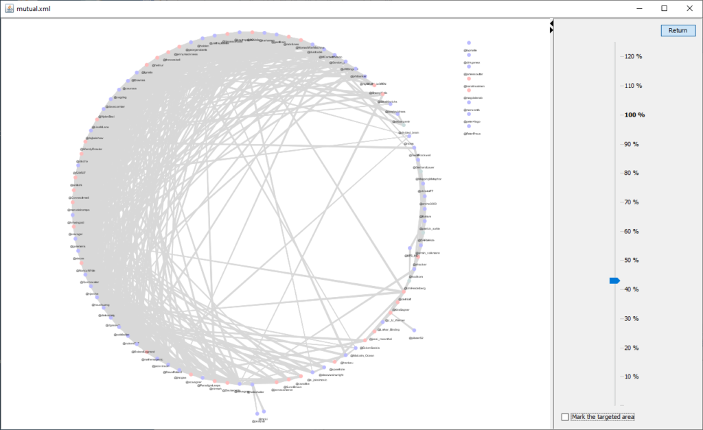
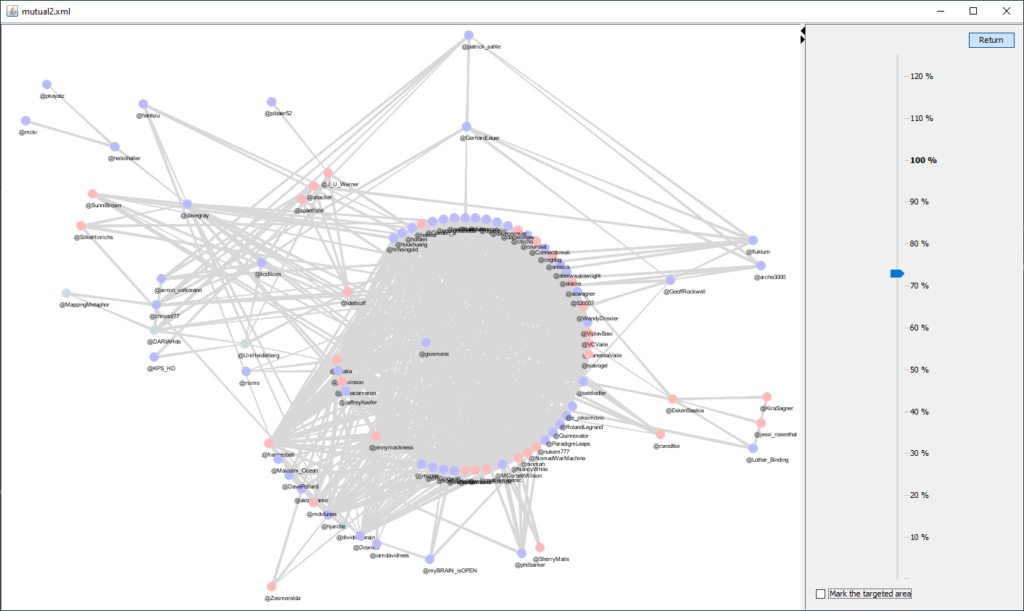
Click the images to explore them in the Condensr demo, and download them (export) to edit them in the full Condensr.
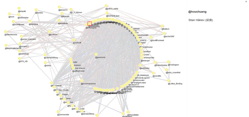
In these demos, the full name associated with the Twitter handle is shown in the right pane. So, if you cannot read some label (which is very likely), just click the icon. Or even move the icon away from the congested area (drag it).
This one can also be explored in H5P: click below to see it on a (slow) test site.
For comparison, here is the output of Gephi.
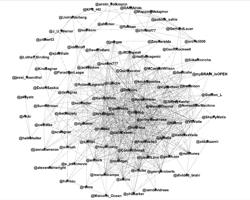
Note: The new EdgeList importer used here is currently only included in the Java distribution format .JAR, not yet in .MSI or .DMG
One thought on “Another large map example”